
Choosing the right paint colors is a crucial element in both interior and exterior painting projects that can dramatically transform your living spaces. This Homeowner’s Guide to Choosing the Right Paint Colors serves as a comprehensive resource, exploring the impact of color on aesthetics, atmosphere, and overall design. With 70% of homeowners reporting challenges in selecting paint colors, it’s important to navigate these decisions with knowledge and confidence.
Understanding how paint color selection can enhance the ambiance of your home is key. From creating warmth in social areas to promoting relaxation in private spaces, color has a profound effect on mood and functionality. This guide will delve into essential guidelines and concepts, ensuring that you not only pick the right hues but also understand how they interact with light and architectural features. Prepare to transform your spaces into inviting retreats with expert advice tailored for every homeowner.
Key Takeaways
- Effective paint color selection enhances the mood and functionality of your rooms.
- Understanding the 60-30-10 rule will help you create balanced and appealing spaces.
- Warm colors stimulate appetite and conversation, ideal for kitchens and dining areas.
- Cool colors promote relaxation, making them perfect for bedrooms.
- Testing paint swatches in different lighting conditions is crucial before finalizing your choices.
- Utilizing a cohesive color palette can unify open spaces and improve room-to-room flow.
The Importance of Color in Home Design
Color plays a pivotal role in home design, affecting both aesthetics and the atmosphere of your living space. Understanding the mood characteristics of colors can lead to meaningful choices that enhance your environment. For instance, cool shades like blue and green are known to promote calmness, while warmer tones like red and yellow can inject energy and vibrancy. Selecting the right color in home design not only elevates the look of your interiors but also contributes to an emotional landscape that aligns with your lifestyle.
How Colors Affect Mood and Atmosphere
Mood characteristics of colors affect how you perceive and experience your surroundings. Light hues, such as whites and creams, can create a sense of openness, making small rooms feel larger. A study noted that painting ceilings in lighter colors supports the illusion of height. Conversely, deep hues can create cozy, intimate spaces, softening the overall vibe. Consider using a gradient of colors to blend areas seamlessly and evoke a sense of space.
Impact of Color on Architectural Features
Color impact on architecture is significant. Specific paint choices can highlight or diminish architectural features, enhancing the beauty of your home. For example, using contrasting colors can draw attention to unique elements, while low-contrast palettes can create a cohesive look that hides imperfections. Homeowners often find that they feel a deeper sense of harmony when the colors enhance the existing structure and flow throughout their space. Choosing a limited color palette, generally three to four variations, helps maintain a unified feel across rooms.
For more details on residential painting options and cost, visit this resource.
Understanding Color Psychology
Exploring the depths of color psychology unveils how color choices impact not only aesthetics but also the emotional environment of your home. This section focuses on the differences between warm and cool colors and their effects on room functionality.
Warm Colors vs. Cool Colors
Warm colors like red, orange, and yellow can evoke energy and enthusiasm, making them ideal for social spaces. These hues encourage conversation and create an inviting atmosphere. In contrast, cool colors such as blue, green, and purple provide a sense of calmness and relaxation, making them suitable for areas designed for rest and rejuvenation.
The use of white and gray also has noteworthy implications in color psychology. White brings a sense of cleanliness and youth, while warmer shades can evoke a cozy feeling. Conversely, cooler whites may introduce a more formal ambiance. Gray, appealing to the disciplined and intelligent, can offer elegance when paired with other colors.
Choosing Colors Based on Room Functionality
Understanding room functionality is vital when selecting colors for your spaces. Consider utilizing warm colors in kitchens and dining areas for a lively environment. These spaces benefit from energetic hues that stimulate social interaction.
For personal areas like bedrooms and home offices, opt for cool colors that promote tranquility and focus. Blues and greens are particularly effective in creating serene environments, enhancing relaxation and productivity. Dark colors may lend a cozy feeling to larger spaces, while lighter shades can make smaller rooms appear more expansive.
Homeowner’s Guide to Choosing the Right Paint Colors
Selecting the perfect paint colors for your home can feel overwhelming. Following specific guidelines can simplify the process, making it enjoyable rather than daunting. Two essential principles guide homeowners: the 60-30-10 rule for color distribution and the creation of harmonious color schemes. Understanding these concepts helps in achieving visually appealing spaces that reflect your personal style.
The 60-30-10 Rule for Color Distribution
The 60-30-10 rule is a tried-and-true method for achieving balanced color distribution in any room. It allocates percentages to different elements of the design:
- 60% – Dominant color, usually found on the walls.
- 30% – Secondary color, typically seen in furniture or flooring.
- 10% – Accent color, showcased through decorative elements.
This structured approach ensures that your chosen paint colors work cohesively together, creating a seamless flow throughout the space. For instance, if you opt for a light blue as the dominant color, complement it with a navy for furniture and a bright yellow as an accent.
Creating a Flow with Color Schemes
Establishing a cohesive design through well-planned color schemes is vital. Consistent colors can connect various rooms, contributing to an overall harmonious atmosphere. Consider the following tips:
- Using a limited palette fosters unity and visual appeal across adjoining spaces.
- Incorporate varying shades of the primary color to add depth.
- Create contrast through strategically placed accents that draw attention without overwhelming.
Implementing the 60-30-10 rule alongside thoughtful color distribution and schemes enhances the aesthetic experience within your home.
Choosing the Right Paint for Different Rooms
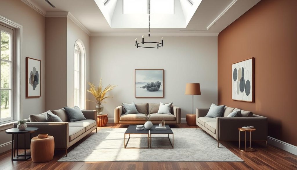
When selecting colors for your home, understanding the unique atmosphere and purpose of each room is crucial. Choosing paint for different rooms requires a thoughtful approach, tailored to the specific needs of each space. In bedrooms, you’ll want to foster a calming and restful environment, while kitchens and dining rooms benefit from vibrant shades that encourage energy and conversation. Living room colors should evoke warmth and comfort, making it a welcoming area for gatherings.
Color Selections for Bedrooms
Color selections for bedrooms typically focus on soft, muted tones that promote tranquility. Shades like pale blues, gentle greens, and blush pinks can create a serene ambiance, essential for a restful night’s sleep. About 75% of homeowners embrace these calming colors as they enhance relaxation and create a personal retreat.
Ideal Colors for Kitchens and Dining Rooms
Kitchen colors often lean towards lively or energizing hues, such as sunny yellows or fresh greens. These colors stimulate appetite and encourage lively conversations. Surveys show that 70% of homeowners favor these vibrant tones to create a cheerful culinary environment. Mixing warm and cool tones can also enhance the visual depth of these spaces by 15%, making them even more inviting.
Living Room Color Choices
Living room colors should reflect a cozy yet sophisticated atmosphere. Warm colors with undertones of yellow or red are preferred by 60% of individuals, contributing to a welcoming vibe. Glossy paints in these areas are typically 20% more durable than flat finishes, making them ideal for high-traffic zones where durability is key.
| Room Type | Preferred Color Tones | Key Benefits |
|---|---|---|
| Bedrooms | Soft blues, gentle greens | Promotes tranquility and relaxation |
| Kitchens | Sunny yellows, fresh greens | Stimulates appetite, encourages conversation |
| Living Rooms | Warm reds, earthy tones | Create a cozy atmosphere for gatherings |
Natural Lighting and Its Effect on Color Perception
Understanding the impact of natural lighting on color perception is essential for homeowners looking to enhance their living spaces. Different times of day and lighting sources can significantly alter how colors appear in your home. You will discover the nuances of how natural and artificial lighting affects paint choices, ensuring that the desired ambiance is achieved.
How Different Times of Day Affect Color
Natural lighting varies throughout the day, influencing the appearance of colors in distinct ways. Rooms with south-facing windows experience intense natural light, which can make pale colors appear faded. Conversely, this brightness brings out the richness in darker shades. East-facing rooms soak in invigorating morning sunlight, intensifying dark colors, but these hues may lose their luster as evening approaches. In contrast, north-facing rooms provide an indirect and often muted light, leading to darker colors appearing even deeper.
Considering Artificial Lighting Types
Understanding artificial lighting types plays a crucial role in achieving desired color perception within your home. Most light bulbs range from 2,700K to 5,000K in color temperature, affecting the warmth or coolness of your space. Lower Kelvin bulbs provide a warm glow, suited for cozy settings, while higher Kelvin options produce a cooler ambiance. The Color Rendering Index (CRI) is also vital, as a higher CRI means a more accurate representation of colors compared to natural lighting. It is advisable to experiment with various light sources and adjust window treatments to manage how natural lighting interacts with your chosen paint colors. For more detailed guidance on choosing the right colors, you can visit this resource.
Testing Paint Colors: Best Practices
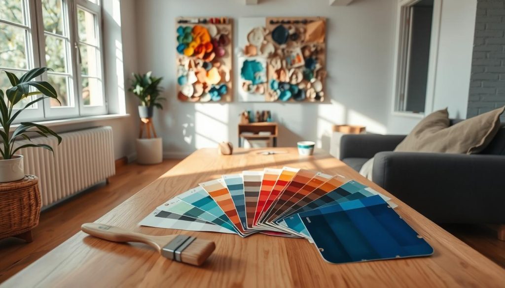
Understanding the nuances of paint testing practices proves essential when selecting colors for your home. Choosing the wrong paint color ranks among the most common decorating mistakes, often leading to costly repaints. To avoid such pitfalls, experience suggests that engaging in thorough sample testing is crucial. By applying color swatches on your walls and living with them temporarily, you can comprehend how the color interacts with both natural and artificial light in your home.
The Importance of Sample Testing
Sample testing importance cannot be overstated. Many homeowners find that paint appears differently in-store due to various lighting conditions. One effective strategy is to extract paint colors from an inspiration piece, such as fabric or artwork, to ensure better coordination with existing decor. Using the largest test swatches possible allows you to visualize the color more accurately in your space.
Living with Color Swatches
Living with color swatches for a while provides invaluable insights into how light can impact paint colors. Natural lighting affects color perception based on the room’s orientation. Testing paints on multiple walls offers a comprehensive view of how colors will look throughout the day. Many professionals recommend directly applying paint onto the wall for the most precise representation, ensuring that the undertones align with your existing home decor.
| Tip | Detail |
|---|---|
| Understand Undertones | Warm (yellow, red) or cool (blue, green, gray) undertones can significantly alter how a color feels in a room. |
| Avoid Store Selections | Lighting in stores differs from home, making in-home testing essential for accurate color choices. |
| Test Under Different Lighting | Assess colors on walls with different exposures to fully understand how light influences them throughout the day. |
| Use Sample Cans | Sample cans typically cost between $3 to $8, offering an affordable way to test colors. |
| Apply Two Coats | Most paint colors require two coats for optimal and even coverage. |
| Deep Colors Need Primers | Some deep hues may require special primers to ensure accurate representation and adherence. |
Choosing Interior and Exterior Paint Finishes
Selecting the right paint finish for your home can significantly affect both aesthetics and longevity. Understanding the differences in paint sheens is crucial for achieving a desired look and ensuring durability in various environments. This section delves into the various types of paint finishes available and highlights recommendations for both interior vs. exterior paint applications.
Understanding Paint Sheens and Their Use Cases
Most types of paint fall into four sheen categories: flat, satin, semigloss, and gloss. Each sheen offers unique advantages suited to specific areas of your home.
- Flat and Matte Finishes: These are ideal for interior walls, popular for their ability to hide imperfections like nail holes and patches. They offer a soft look but are not suited for high-traffic areas.
- Eggshell Finishes: A slight sheen makes this finish appropriate for low-traffic areas. It holds up well but is best used in spaces less likely to accumulate dust and dirt.
- Satin Finishes: Known for their mildew resistance, satin finishes can endure light scrubbing, making them excellent for kitchens and bathrooms. They balance durability with a pleasant sheen.
- Semigloss and Gloss Finishes: These finishes provide a striking, reflective appearance. They are perfect for areas requiring durability and are often used on trim and moldings.
Durability Considerations for Different Spaces
When it comes to selecting paint for various environments, durability plays a critical role. The choice often depends on moisture levels and traffic:
| Paint Finish | Best Use Location | Durability Level |
|---|---|---|
| Flat | Interior living rooms and bedrooms | Low |
| Eggshell | Low-traffic areas | Moderate |
| Satin | Kitchens, bathrooms, and children’s rooms | High |
| Semigloss | Trim, moldings, and cabinetry | Very High |
| Gloss | High-moisture areas (e.g., kitchens, bathrooms) | Very High |
Using water-based latex paint is standard for most home projects, given its ease of use and cleaning ability. For rooms exposed to high moisture and humidity, such as kitchens and bathrooms, oil-based paints can provide a more durable and rich finish. Understanding these factors ensures your chosen paint finishes enhance both the beauty and longevity of your home.
Color Selection for Open Floor Plans
Open floor plans have gained immense popularity over the past decade, presenting unique challenges in color selection. Homeowners often seek effective strategies for zoning with colors while ensuring a cohesive aesthetic throughout interconnected spaces. A harmonious color palette consisting of three to five colors can facilitate this process.
Strategies for Zoning with Color
One effective method is varying color concentration across different areas. For instance, using soft sage green, such as Riverdale N410-3, in one section while applying light blue-gray, like Urban Raincoat N440-2, in another can create visual interest. To emphasize specific areas, consider the placement of darker shades on focal walls or vibrant accent hues on backsplashes. Using a dark, medium, and light shade from the same color family typically yields pleasing results, making distinct areas within the open layout.
Maintaining Cohesion in Open Spaces
To preserve a cohesive look, utilize the same paint sheen throughout your space. This approach anchors the design, creating a fluid connection between the rooms. You might consider painting the ceiling in a neutral tone while opting for white trim and woodwork to provide a crisp finish. Incorporating color in unexpected places, such as cabinets and ceilings, can add creative depth to your design.
Many homeowners struggle with these decisions. Tools that visualize different wall colors can alleviate confusion. Adding molding above windows or doorways can also help separate colors on a long wall, enhancing the overall look. For additional insights on effective color techniques for your commercial space, consult experts who specialize in unique solutions.
| Color | Shade Type | Recommended Area |
|---|---|---|
| Swiss Coffee 12 | Light | Ceiling |
| Urban Raincoat N440-2 | Medium | Living Area |
| Riverdale N410-3 | Soft Sage Green | Dining Area |
| Bold Color (e.g., deep navy) | Accent | Backsplash |
| White | Trim | Woodwork |
Ultimately, experimenting with various shades can help you discover the perfect balance in your open floor plan, making it not only functional but also visually captivating.
Conclusion
Choosing paint colors is not merely an aesthetic choice; it’s a transformative process that shapes the very essence of your living spaces. Throughout this homeowner’s guide, you’ve explored various strategies to ensure that your color selections enhance your home’s charm and functionality. Understanding color theory, the impacts of natural and artificial lighting, and the right finishes can significantly elevate your interior design while reflecting your personal style.
From the warm hues that invite guests into your living room to the soothing shades perfect for bedrooms, effective painting can create an atmosphere tailored to each room’s purpose. It’s essential to harmonize your choices with the architectural features of your home and the aesthetic of your neighborhood. As you prepare to embark on your painting journey, remember to sample potential colors against your home’s natural light, ensuring they resonate beautifully at different times of the day.
If you’re considering professional assistance, reach out to experts who can guide you through the process. The team at Geelong Painters offers comprehensive support in selecting and applying the ideal paint to elevate your spaces. Embrace the opportunity to transform your home—your vision and creativity are just a brushstroke away!
FAQ
How do I choose the right paint colors for my home?
Begin by considering the mood you want to create in each room, understanding color psychology, and how specific colors can affect your atmosphere. Utilize the 60-30-10 rule to establish a balanced color distribution, and test samples in various lighting conditions to see how the colors appear at different times of the day.
What is the 60-30-10 rule in color selection?
The 60-30-10 rule is a guideline for creating a balanced color palette. It suggests that 60% of a room should be a dominant color (walls), 30% a secondary color (furniture), and 10% an accent color (decor). This approach helps to create a visually appealing and harmonious design.
How can natural lighting affect my paint color choices?
Natural lighting can significantly alter how a paint color appears in a room. Colors may look different in the morning light, afternoon sun, or night-time artificial light. Always observe your chosen colors at different times of day to ensure they align with the desired mood.
What colors should I use in specific rooms?
For bedrooms, opt for soft and calming hues to foster relaxation. Kitchens and dining areas benefit from energizing colors that stimulate appetite and conversation. Living rooms typically thrive on warm and earthy tones that encourage a welcoming atmosphere.
How do I effectively test paint colors before making a decision?
Always apply paint swatches directly on the walls and live with them for a few days. Assess how the colors look in both natural and artificial light. This practice helps to prevent mismatches and ensures you are happy with your final choice.
What are the differences between paint finishes?
Paint finishes range from flat and eggshell to satin, semi-gloss, and gloss. Each sheen has distinct characteristics; for instance, flat finishes hide imperfections but are less durable, while gloss finishes are highly reflective and ideal for high-moisture areas like kitchens and bathrooms.
Can I use the same color throughout an open floor plan?
While you can use the same color, it’s often beneficial to introduce slight variations or complementary colors to differentiate functional areas within an open layout. This approach maintains cohesion while allowing for the distinct zoning of spaces.